The goal of instituteRice is to create an online mapping platform that illustrates the evolution of the Rice University campus, as it existed as well as it has since been imagined. Primary sources from the Woodson Research Center, such as photographs, historical maps, and campus plans, will be located temporally and spatially while their associated visual and geographic data will be integrated across a number of databases (including an open-access digital library of images, a geographic information system, an open source relational database, and a content delivery web service). The relationship between the various project elements of the project will produce a web environment where qualitative and quantitative data are simultaneously loaded from an API, rendered across platforms, customized in many views, and probed by users in a system that supports multiple and interconnected expressions of diverse data sources. Rice University's campus is, in fact, particularly well suited to being captured in such a web map environment considering the many versions it has initially undergone and how it has progressively grown since its inauguration. Scaled down into a mobile app, the Rice community will be able to walk about the campus while visualizing it as it once was. Alums, in particular, will be able to use this temporally accurate map to contribute and store their memories (e.g., Name, Class, Memory text, Date, Photo). In its first iteration, the project will focus on the history of the campus, the organizing of its architectural archives, and the mapping of its evolution between 1908 and 1912.
The main elements of the project are as follows:
Eras
The map will be divided into 6 - 10 eras that exemplify Rice's development. Each era displays with a slideshow of images and when selected, each will have an overview page with a pertinent description and images (views / maps / plans / aerials). These images will act as jumping off places for exploring the map further. A less-confident user could then just jump between each era in sequence and still have a valuable experience with the map.
Temporal Display
By moving through time, users will be able to see how the urban form of the campus changed over the years. This technically means that time is as much an organizing element as space of both the map and its data. A timeline will, therefore, occupy a primary position to allow users to navigate the map chronotopically. The timeline will also function as an information display, showing the user what years and data are available as well as how they are dispersed across time.
Primary Sources
Users will not only see displayed features on the map but will also be able to consult primary sources that describe these features, such as digitized historic photographs, maps, plans, and aerials of the campus, which will be stored in a separate database and accessed with an API. Orientation information will also be included in the data to inform users which direction they would need to look to see a linked photograph, for example.
Crowd Sourcing
Users will be able contribute data to the map, which will in turn be curated prior to being pushed to the platform. Some key challenges to collecting data from users involve creating user accounts and logins while allowing users to manage their own submissions; monitoring user submissions for accuracy and appropriateness; reporting and handling errors; and managing, organizing, as well as curating uploaded files.
Search
Search functionality will work on two different sets of data:
- Data probe text (i.e., activating a search result will open the data probe allowing the user to view the text and the attached media).
- Map feature names (i.e., activating a search result will zoom the user to a particular location and perhaps change to the time-period where it is visible).
Map Output
The platform will have two ways for users to create and share their maps. For users who would like to share their maps over the internet, each map option (layer visibility, year, map extent, etc.) can be encoded and read through the map URL. This will give users the ability to share their exact map as a link through email or social media. It will also allow them to return to exactly where they were in the map or save the map state to use in interactive lectures. For users who would like to export a particular map option, the platform will have the ability to output a user-generated map as a PNG. The user will simply send their current layers, year, and map extent to the server, which will dynamically render the map image and send it back to the browser. The resulting image can be used in documents or Powerpoint presentations.
Mobility
The platform will support touch-controls, tablets, and mobile phones from the start. The mobile map, in particular, will use standard geolocation, which allows users to locate themselves on the map.
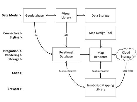
Technology
The platform will require a “geostack” that consists of the following parts:
- An ArcGIS geodatabase sitting on its own GIS for server instance [i.e., Server 2012R2 64bit., 4 CPU’s, 8gb Memory, 4 internal hard drives, Operating System: 60gb; Database: 40gb; Database logs: 40gb; Recovery drive: backup of DB logs and databases, 30gb]
- A visual Library called Shared Shelf Commons, to which Rice University subscribes and which makes available an API that the system will use.
- A TB of data storage space on Rice University cyberinfrastructure
- A PostGres database sitting on a kvm instance that runs on a Rice University cluster [i.e., a stock Red Hat Enterprise Linux (RHEL) 7.1 install with 4 cores, 16Gb RAM, and 80Gb hard disk space]
- A content delivery web system and service made of a map renderer (Mapnik); a map design tool (TileMill); storage on Amazon AWS for the rendered tiles; and JavaScript mapping library.